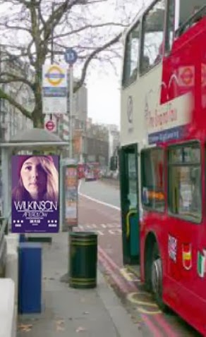
Today I found some spare time have attempted to superimpose my magazine advert onto a bus stop in London. This would be a prime example of where I would place my advert. London is a very busy place which attracts lots of people, meaning that if I was to place it on a bus stop in London it would attract multiple people and maybe even interest my secondary audience (AD and E). Also public transport is regularly used by thousands who travel in and around London. This means that my poster could attract the attention of those waiting for the bus and also those who are on the bus due to its bright bold purple colour in contrast the the dull white/gray bus stop.
I would also place my advert/poster on sides of buildings in london, im music magazine such as KMAG and MIXMAG which are drum and bass/dance music magazines and also in other clubs such as Fabric and Ministry of Sound. Placing my advertisement in clubs which attract my target audience would mean that I could gain more interest in my music video. Also, as I know that most of my target audience go to clubs like these, meaning that my efforts will not be wasted in trying to address them.
Digipak finishedt from
emmacalder123
Here is my finished Digipak. I am very pleased with the outcome of it as I feel that it confroms well the the genre of Drum and Bass. This is mainly throught the two inside images, one which is a picture of my protaganist with a blurred effect on it and one which captures a crowd at a concert/festival. The image which has a blurred effect portrays the feeling intoxication. The image distorts your vision making you feel too distorted and out of place. In looking at this picture, my target audience will be able to feel how my main protaganist is feeling, i.e. intoxicated allowing the feel empathetic toward my protaganist and the situation that she is in. My target audience are also likley be able to identify and relate to my protaganists situation, as 16-25 are heavily criticised by the media for their love of alcohol and the activity of binge drinking they undertake, meaning they are likley to have been or know some one to have been in a situation like my portaganists, allow them again to connect with my portaganist on a emotion level, also allowing them to really delve into the narrative, making them watch it till the end, additionally meaning my digipak follows Blumler and Katz's Uses and Gratifications theory.
I feel that my digipak also allows my target to make a link with the magazine advert and music video. The colour of the saturation placed on the images of both my magazine ad and digipak mean that the audiene will be able to link the two products together, in turn promoting eachother. I feel that font 'birth of a hero' also allows this to occur due to its orginality. Moreover, the theme of intoxication from the music video is carried on to my digipak, again meaning that my target audience will be able to link the two together.
This is my magazine advert. It is very similar to the one that I drew up in the planning stages of creating it. Planning before hand helped me as I already had a certain picture in my head that I wanted to created meaning I could just get on with it quickly and efficiently. I chose the colour scheme of purple and white as I felt it worked well together, with both the image and text being able to work together and both be as eye catching as the other. I felt this was important as the text such as reviews are just important as a striking image. I stuck with the font that I spoke about briefly in planning and to accompany it I used Impact and (need to put the fonts name here). These fonts work well together.
Using my draft magazine advert I was able to make changes to make sure my finished magazine advert look professional and visually pleasing. As I mentioned in the post I wanted to change the date from the '30th November 2013' to '30.11.13'. I have done this and feel that it does infact look better having the date in the numerical version as it flows well with the structure of the advert, meaning that also aspects with recieve the same amount of attention they all need. I also tried to make the line splitting up the image and text less visable, in comparison to the draft it is infact less visble however you can still see it a little bit. I did try and make it less visable but this the changed the colour of the advert to a darker purple which I did not like. Another change that I made to my finished advert is I moved the reviews dow a little as I felt that there was too much of a gap between the date of release and also the words 'Available on digital download'. This movement of the reviews has seemed to close the gap, making the advert flow visually more.
Overall I am pleased with my music advert, and hope to achieve the same look with my digipak so that the potential audience are able to relate the digiapk, the advert and the music video together.